Exposure
Here is an image and its associated histogram just to show a few basics.
This is what the histogram looks like. A spike on the left representing black with no detail, a spike on the right representing white with no detail, and then everything else goes in between them with darks on the left, lights on the right and mid tones in the centre.
Here are some more images, along with some more histogram basics, that should help to explain why it is so difficult for manufacturers to write a program to give correct exposure in all situations. Have a look at this image and the resulting histogram. On the left of the histogram we have the dark part of the image and on the right we have the light part of the image, shown as two separate ‘hills’. So what is this picture of?
It’s actually a sheet of white paper so everything is white to a person looking at it. But half of the paper is in sunlight and the other half is in shade. This shows that there are many situations where the camera has to make compromises while trying to achieve correct exposure. Don’t think that the histogram gets the tones the right way around according to how the picture looks on the screen, it always shows darks on the left and lights on the right
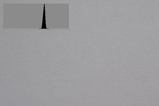
So what if we only take a picture of the area of the paper that is in the sunlight, or just in the shade? What will the exposure and histogram look like? Like this, for BOTH!
This could be either the sunlight or the shade image, they both came out the same.
When it’s a neutral color the camera’s meter aims for ‘average gray’, somewhere near the middle. The camera does not know the difference between gray in normal light, white in shade or black in sunlight! How could it? Something to think about when trying to work out why your camera does what it does.
So how do we get ‘correct’ exposure in an image when we have such a variety of lighting to deal with? In a later chapter ‘exposure compensation’ will be discussed which deals with correcting the exposure when the camera gets it wrong, which is actually quite often!
What happens when we introduce a third variable to the scene, besides the shadow and sunlit areas of the paper? Let’s introduce a black lens cap in the shaded area. Compare the histogram of this image with that of the first image. Do you notice how the left peak has dropped a little, but we now have an extra spike to the very left of that? Why has this happened? Well the lens cap is now using up some of the space in the shadow area, so that original left peak has less of that particular tone to represent, but since the lens cap is even darker than the shaded paper it creates another hill on the very left, which represents black with very little detail.
Next we add something lighter than the shadow area but not as light as the sunlit part of the paper. Can you predict where the histogram will show this? Somewhere between the left and right peak perhaps? Definitely! It now shows as a rather spread out mound between the two, because it is a more average tone.
Try to predict what the histogram will look like if we introduce our black lens cap to the shadow area again. Where will we see it represented on the above histogram? Obviously if it is darker than the white paper in shade it must fall to the left of the left hand peak once again. And here we have a more complete histogram! On the very left we have the spike of the black object in shade, after that we have a nice sharp hill representing the white paper in shade, then we have a shallow hill with a little peak on it representing the various tones of the leaf, and finally we have the steep hill on the right representing the white area in sunlight. Be aware that there will be some overlapping of tones between the different subjects on almost any histogram so they are not always this clear-cut to interpret.
A large hurdle to overcome is understanding ‘how the brain sees’ compared to how the camera sees, because often a lot of confusion is created by taking a picture and seeing that it looks nothing like how you expected it to look. Take the picture of the white paper in sunlight and shade for an example, both sides looked white to me when I looked at it on the table. It’s all about something called ‘dynamic range’. This is basically the limit of what you can see from the darkest part to the lightest part of an image.
A camera’s dynamic range is very limited compared to how our brain ‘sees’. The example that best illustrates this is when you look at a bright window and see something like this and stare at it for a while
It all looks pretty ‘normal’ to you until you look away and blink and you see this pattern when your eyes are closed………
Why does this happen? Perhaps the simplest way to describe it is that your brain/eye combination ‘fixes’ the situation by darkening the bright areas so that the exposure looks right for the inside and outside at the same time (realistically it is caused by a chemical (rhodopsin) in the retina of your eye being depleted by the bright light), and when you turn away and blink it takes a while for it to ‘reset’ the pattern it created in the process which is why you see that shape. It involves a lot of hard work for your brain because the scene has a high dynamic range, from very dark all the way to very bright. Let’s have a look at how the camera sees this scene. When I take a photo of it I get this …..
The camera’s sensor doesn’t have enough dynamic range to capture the dark interior of the house and the bright exterior all in one image. The window has become totally white with no detail and is therefore beyond the limits of the sensor’s dynamic range. Your brain-eye combination has a very high dynamic range, it can see the bright exterior and dark interior all in one scene.
Now the outside detail can be seen but the inside has become totally black with no detail. Once again capturing detail inside and outside at the same time is beyond the dynamic range of the sensor – you have to choose what you want to have correctly exposed because what you can capture, all in one exposure, is limited by the dynamic range of the sensor.
Try this: Set your camera to spot metering and find a scene like this – bright window and dark room. Turn off auto ISO, use ‘A’ mode or ‘Aperture priority’ and take a photo with the window in the centre of the frame – spot metering is only seeing the light outside. Now take another picture with the window to the side and the centre focus point of your camera on the wall inside. You will see a vast difference in the exposure – in one image the light outside the window will look right while the wall inside is close to being black, and in the other image the wall will look right while the window is white.
Now when we compare these images how much difference is there between the shutter speeds chosen by the camera? Well compare 1/5th sec to 1/250th sec. 250 divided by 5 = 50. The light outside is 50 times brighter than inside! Of course depending on conditions where you are there will be variations in this experiment so don’t think there is something wrong if you don’t see a difference of 50 X .
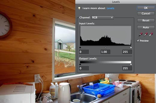
The initial image in this chapter is the result of combining the two images in Photoshop – it’s not nice to have to resort to editing images to get what you want but sometimes it is unavoidable. This combining of the two images results in a rather crude ‘High Dynamic Range’ or ‘HDR’ image.
Another solution would be to use flash to light up the inside of the house while exposing correctly for the outside light.
So what about an image where the light is even enough not to have to do this and what does the camera’s metering system aim to achieve to obtain ‘correct’ exposure?
Try this: put your camera in ‘P’ mode. Use centre weighted or matrix/pattern metering mode and take a picture of something in an even lighting arrangement – perhaps a dull color or simply a patch of grass or blue sky with nothing else in the image. Now check your histogram.
Side note: If anyone asks why you are using Program mode tell them ‘P’ stands for ‘Professional’ but if you reach the stage where you don’t need to use it then you tell them ‘P’ stands for ‘Panic’ because it tries to do everything for you besides turn on the flash. (That’s why it’s best to stay away from the fully automatic modes because you never know when it will pop the flash up when you don’t want it to.)
With an even patch of dark blue sky the histogram should look something like this: Very low contrast, because there is very little difference in the tones of the scene.
The camera’s metering system is designed to try and produce an average gray in each scene whenever possible. When reading a histogram always bear in mind the context of the image. On the very left is ‘black with no detail’ and on the very right is ‘white with no detail’. ‘Average Gray’ does not necessarily mean the color gray but rather an average tone in any color.
Using the same settings I took a picture of the (dry) grass in front of me. Now there’s a difference! It may not look like it but there’s a lot going on in this image all the way from black with no detail to white with no detail (The two spikes at either end) and everything in between. That’s why you have to look at the context of the image and resulting histogram. The meter may aim for an average reading and this has a hump in the middle in the same place as the image of the sky and both exposures are correct, but this one has a lot more contrast, there is information at both ends of the histogram, that’s what contrast is all about!
Now we move lower in the sky where there is some haze on the horizon and a greater contrast in colors, not as much as with the grass but still a lot more than previously. I used the same exposure settings as the previous images. We have some of the neutral tone blue sky near the top of the image, white clouds at the bottom which account for the high spike on the right of the histogram, and the tip of a tree and some darker looking cloud which accounts for the flat line at the very left of the histogram.
Now we add some more variables to the scene by once again using the same exposure so we know the different parts of that histogram will stay in the same place. Because I have gone to wide angle the original white spike is lower because the white clouds are a smaller part of the final image. Look at the picture for a while and try to work out what that spike is at the very right of the histogram.
Remember ‘white with no detail’? Look at the lower left of the image and the bright reflections off the white paint of the closest house. This is the tricky part of reading histograms, what do you ignore? In this case the histogram is really good for the rest of the image and the bright part of that house is not all that important to the image so the exposure is good enough for that scene. If you were to back off the exposure to show some detail in that white area the rest of the image would be under-exposed. If you print it out as it is there won’t be any detail in the white part of that house but if it’s for your own personal use and the white part of that house isn’t important to you then don’t worry about it, the rest of the image is well exposed. Either way, it would be rejected by an image library, due to that spike, but there isn’t much other option besides going back when the lighting is better or taking two different exposures and blending them later in Photoshop. Our original example shows this concept quite well.
As we can see there is a large spike of ‘black with no detail’ on the left, a very small amount of ‘correct’ exposure across the middle of the frame, a small hump of ‘white with detail’ of the clouds and a small spike of ‘white with no detail’ on the right.
So which image is correctly exposed? It depends what you wanted to show and what is important in the image. If you only wanted to show what it looks like inside then the first image is ok. If you wanted to show someone how nice the weather was outside then the second image is fine. If you are taking pictures for a real estate agent to show how nice the house is inside and outside then you had better either combine the images or add flash inside with the outside correctly exposed.
And when the images are combined we have a more even histogram – not perfect by any means due to the spikes at either end but sufficient to illustrate what we are aiming for and give an idea of what the various areas of the histogram mean
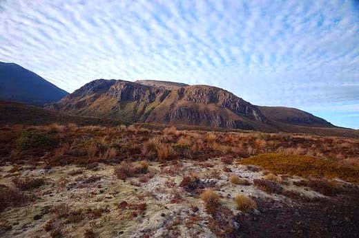
An example of a potentially good looking scene that never had the right light and is harder to look at is this shot of a mountain at the beginning of New Zealand’s best one day walk, the Tongariro crossing. It takes a bit of work for your brain to even out the lighting in this image and even more so when you are there in real life trying to adjust your eyes for the bright sky and dark shadows.
Once you come to grips with the fact that the camera doesn’t capture exactly what you see due to its limitations, and learn to work around those limitations, you will be closer to capturing the images you have envisioned in your mind before pressing the shutter release.
