2 Musical Histograms
Many people take a while to grasp the concept of reading a histogram and working out what it should look like, without actually realizing that they have seen something very similar for years. How so?
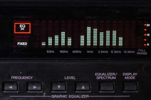
Many sound systems have a graphic equalizer display that shows a graphical representation of the various frequencies of a piece of music. When you listen to the music playing and watch the bars bouncing up and down you notice that the pattern changes all the time. When there is a heavy beat the bars on the left jump up and down, when there is a high pitched noise the bars on the right jump up and down, a human voice makes the centre part move upwards and when there is a whole lot going on the entire pattern is busy jumping up and down. It’s a bit like watching a silent video with the histogram showing. If the video is correctly made and properly exposed then the histogram will still keep changing its pattern, it will never be wrong, it will just be showing different patterns for the variety of different scenes.
Here is an image of an equalizer pattern with a wide variety of noises going on, it looks very much like what a good photograph’s histogram would be like for an evenly lit scene.
But as mentioned there is variety in music and in photos, not all histograms and equalizer patterns will look the same, but that does not mean they are wrong, we have to view them in their context. If a scene has a lot of darkness in it the histogram will move to the left, as with the sound of a menacing drumbeat in a movie when something is about to happen, the pattern looks like this just before the shark fin surfaces.
It’s all bunched up on the left, which is simply an accurate representation of what was going on at the time. If you were to take a photo of green grass and the histogram looked like that then you have done something wrong because it would need to be near the centre, but if it’s a picture of some dark brown soil within the same scene then the histogram would be correct.
The next image shows the pattern made by a singer with a high-pitched voice [right bump], and some low music in the background [left bump].
A few minutes later in the movie there was an explosion with a lot of shouting and screaming which almost filled the entire pattern.
As with music and video, our histogram may assume an average look in a very busy scene and then we can judge our exposure based on its position. But we have to view histograms in their context because our camera’s meter is like an equalizer that wants everything in the middle, even when it should rather be to the left or to the right. It assumes that we have an average scene every time when it meters, and ends up trying to make all our exposures the same, which often ends up in incorrect exposures. The chapter on exposure compensation goes more deeply into this.
So if you have exposed correctly and the image looks right don’t think that it must be wrong because you don’t see the ‘ideal’ histogram pattern, a drum beat or cymbals will show at opposite ends of the equalizer pattern but that doesn’t make them wrong, they are supposed to sound different and be at opposite ends of the pattern. It’s the same with photographs, there are a wide variety of subjects and some of them have histograms very different from what is often shown as the ideal histogram pattern. Something that has a lot of darkness in it will bunch up to the left while lots of white should show a bump on the right. Check the histograms of your images regularly so that you learn what they look like, in the same way that you get used to watching the equalizer pattern showing differently for a variety of music. Only when you have learned to put the histograms in their right places can you start trying to compose masterpieces because you’ll never be able to do it before your instruments are properly tuned.


